The essential part of your business blog is not the content; it is the data collected from your visitors. This data can be compiled into an easier way to read the information tracked by Google. Not everyone can read or can easily discern the data that are generated through Google through their various online applications. This post will guide you to help you create Google Looker Studio Reports.
On October 11, 2022 – Google Changed the Google Looker Studio to Google Looker Studio.
Table of contents
What is Google Looker Studio?
“Looker Studio is a free tool that turns your data into informative, easy to read, easy to share, and fully customizable dashboards and reports.” And creating a customized report will allow you and your company to see how your goals are progressing. Read more here for extra information.
But what do you need on your Google Looker Studio customized report? Well, I’m glad you asked. These reports can hold whatever you want them to for your specific goals and focus. Feel free to read this post for tips to make business goals: Tips to make your business goals a success.
Now that you have determined the goal you want to achieve for your business blog let’s show you how to create your customized report.
Note: we are going to focus on Setting up a Looker Studio Google Analytics report today only. There are lots of other reports you can create.
What to include in your Google Looker Studio Report?
First, review the data that you may look at often in Google Analytics. Write down notes on what the data is called. These titles are usually in the first column of each report. So keep that in mind when making your list. You may want to track some of these areas: Pageviews, Page Titles, Exit Landing Pages, AdSense Ads Clicked, Exit Page, Destination Page, Average Time on Page, Page Per Session, and Goal Conversion Rate.
If you want to review data over time, you can use a double-line chart for an easier view. Data date-range comparisons are a lot easier to read in a graph format. If you find that you can interpret the data, you can turn the data into a graph for easier understanding.
You can add more than one page to help you get more out of the app. I prefer three pages, one for yesterday’s data and two for last month compared to the prior month’s data. This allows me to see all the source data in one place instead of jumping around to different online resources.
Tips on How to Create the Looker Studio Report
It is time to create the report! Using your Gmail login username and password, go to this Data Looker website and log in. Press the “Create” button and press the “Report” button.
Now, connect the Data. That is the data that is where your website stores the information. It could be data from Google Analytics, Google Ads, and many other websites (source) options you can choose from to make your report effective. Select the account that you want to be the source of your data.
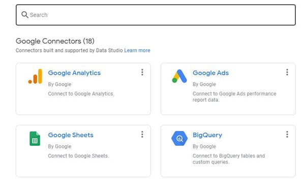
You must select the Account, then the Properties, and the View website (they are in three columns) before you can press the Add button. After this, press “Add,” and your data source is added. It then asks you to verify that you want that source (i.e. Google Analytics) to be added to your report. Press the “add to report” button. This is what it looks like when it is blank.
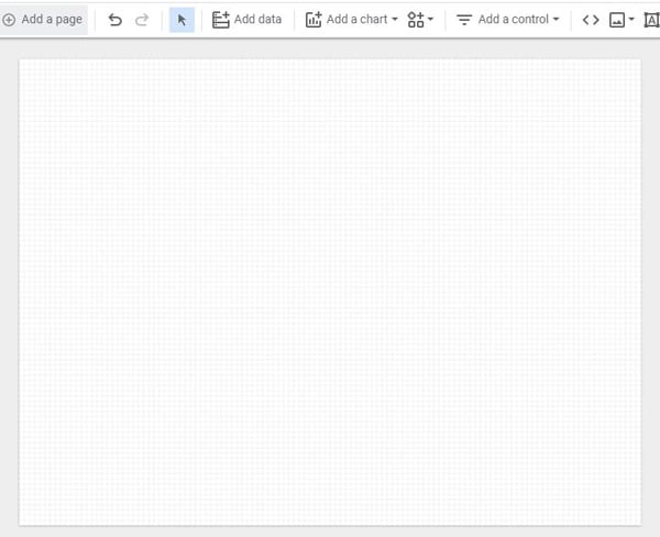
At this point, you need to add data or a chart from your source to the page. It starts with the first square that lists page titles with new users for the last 28 days or something similar to start. This can be modified by clicking on the created table. A menu pops up, and you can modify the areas like date, fields, style, comparison, alignment, color, header chart design, and many others.
Charts you can make in Google Looker Studio
The chart includes things like tables, scorecards, time series, bar graphs, pie graphs, Google Maps, Geo Charts, Lines, Area, Scatter, Pivot tables, Bullet, and Treemap. Here’s the image below.
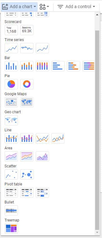
After you select the table or chart you want to use, Pick the timeline you want to use. The options you can choose from are yesterday, custom range date, last 7 days, last 28 days, and last month. And, now you also compare the previous period and the previous year.
Quick tip to set up the right timeline for you
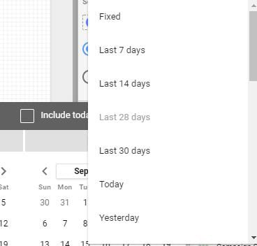
To modify the timeline, select custom and click on the last 28 days, and then select the top right corner: Last 7 days, Last 14 days, Last 30 days, today, yesterday, This week (starts Sunday), This month, Last month, etc… There are many more options.
Note: if you select a specific date range, it will not change when you return the next day. I prefer to set it for the last 7 days or last month rather than the last 28 days. And I like to compare it to something, so I usually compare it to the last period. That means if I use yesterday’s data, I compare it to the day before.
Design your report for your business
In the Looker Studio theme and layout, you can create your own report design to correspond with your business. You can upload your business logo and change the color and layout of all the pages.
You can also create more than one page if you can’t fit all the charts and graphs on one page. So, don’t feel the need to make your graphs and charts too small.
How it looks when you are finished Google Looker Studio Page?
You can design it any way that works for you and your small business. I personally like it to be horizontal because it allows me to see more without scrolling. I’m lazy that way. =)
Deciding the best way to lay out your report is good to do before you even start doing the data gathering and laying out the charts and tables. Draw it on a piece of paper to help you figure out what you want to show. Below is an example that Google has as a premade dashboard provided on a possible layout, but it can be more than this.
Remember that modifying this data report below may create unique user challenges. Some converted well, and others were more frustrating to change what I needed to modify. I rather review the data report below and then make my own separately from using their template. That way, my colors, and design layout were to my business goals and not what Google thinks they should be.
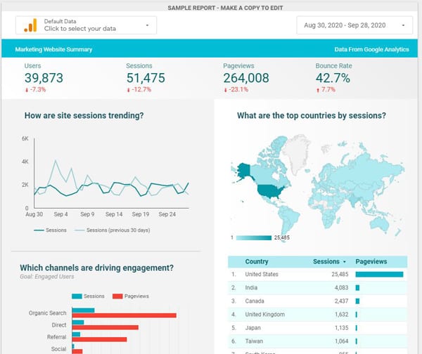
You can use this template by adding your website source URL to it at the top left if you want.
I hope this gives you a glimpse of the Looker application. If you decide to try it for yourself, please come back and leave questions or comments about this free service from Google. I would love to hear from you.
If you want help creating this report, feel free to contact us at our Website Help and Maintenance services page.
